Sun Serum

Sun Serum is a company known for its golden colored hair products. Each one of their products is designed to help customers deal with common and frustrating hair problems. Their mission is to bring a little more light and positivity to their customers through providing easy, healthy solutions to their hair frustrations. Sun Serum targets an audience of women who are struggling with hair growth, texture or loss. They value their hair health and are looking for reputable and affordable solutions. They are looking for a product that will remove their feelings of frustration and hopelessness, and instead provide the relief and positivity they need.

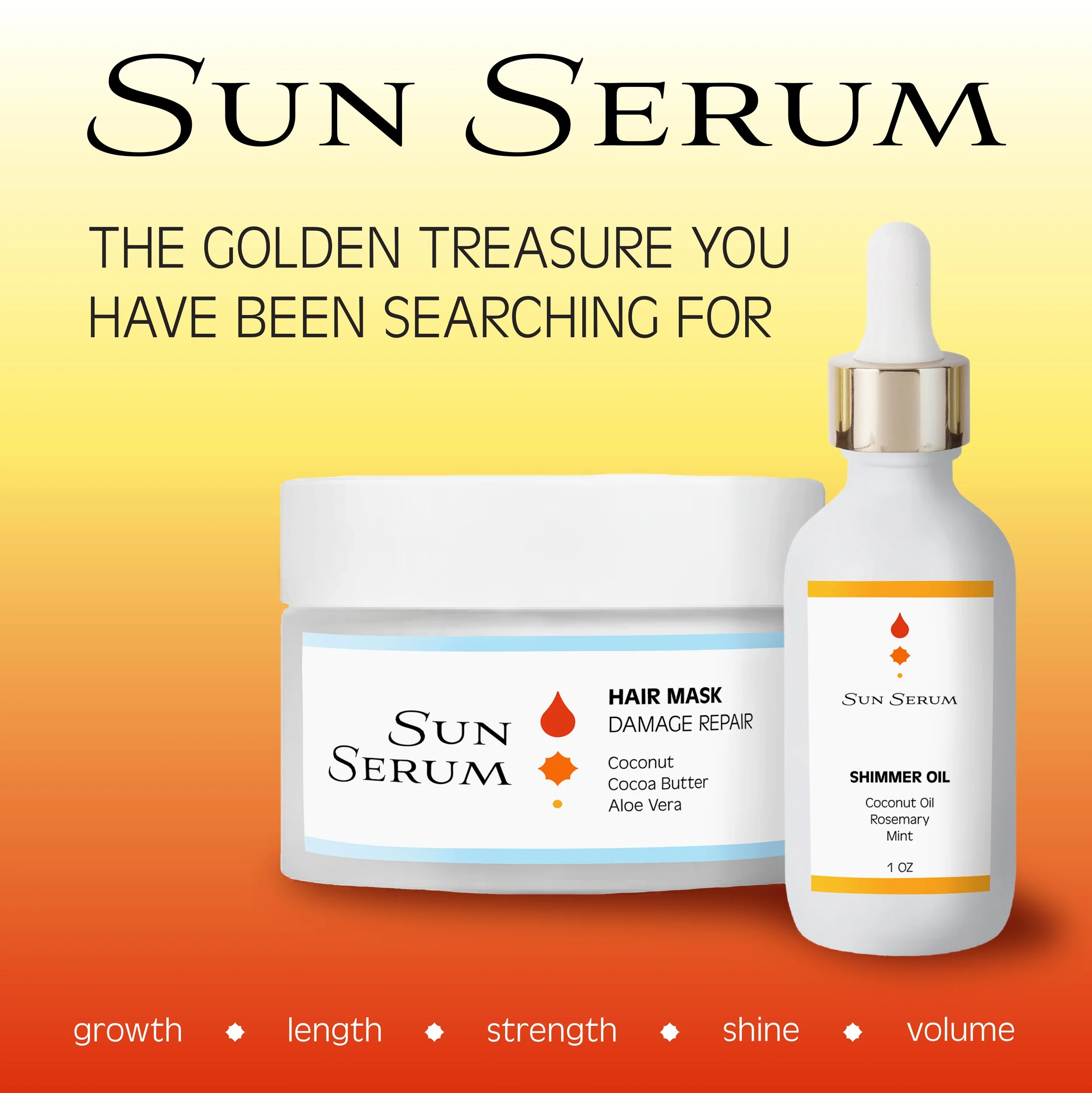
I chose to embody this positive mindset through a color pallet that shouts optimism. The golden, sunset color theme communicates energy, happiness, and hope, which are exactly the emotions that Sun Serum wants their customers to feel. The product packaging was designed to stand out from other brands, letting the ingredients speak for themselves, while still catching the eye with accent colors.

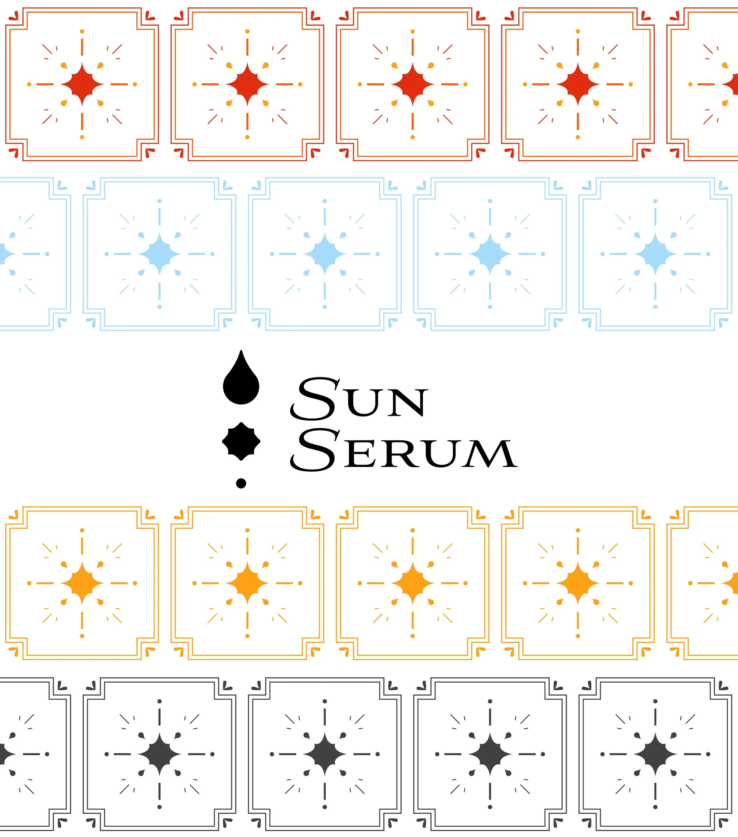
The Sun Serum brand pattern was inspired by classic tile patterns. It provides a perfect backsplash for brand photos, social media advertisements, and potentially merchandise as well. It can be used in a variety of ways, whether as a bold design addition, or a subtle accent to the background.

The Instagram feed mockup demonstrates how the chosen color pallets and patterns should be consistently incorporated into Sun Serum social media, creating a consistent, cohesive online brand identity. While occasional deviations from warm tones are acceptable, commitment to consistency is what makes those deviations possible.