Ocean Roots
Ocean Roots is small, fictional beach shop located in Ocean City, MD. They don’t like to label themselves as only one type of business, instead viewing Ocean Roots as a café, souvenir shop, and book store all in one. In a city where consumption, chains, and junk food reign, Ocean Roots is an oasis where a natural, sustainable beach experience is valued most. They cater to an audience of health conscious individuals, nature-enthusiasts, readers, and vegan beach lovers. They were looking for branding that reflected their all-natural, sustainable mission.
The first thing I designed was the logo and color pallet. I chose earth tones that can be used for their subtlety, but also look great in vivid tones, giving Ocean Roots flexibility in their merchandise designs. The owner was looking for a simplistic logo that utilized root and ocean imagery. For my design I created a beet root, its leaves curving to form the shape of a wave.
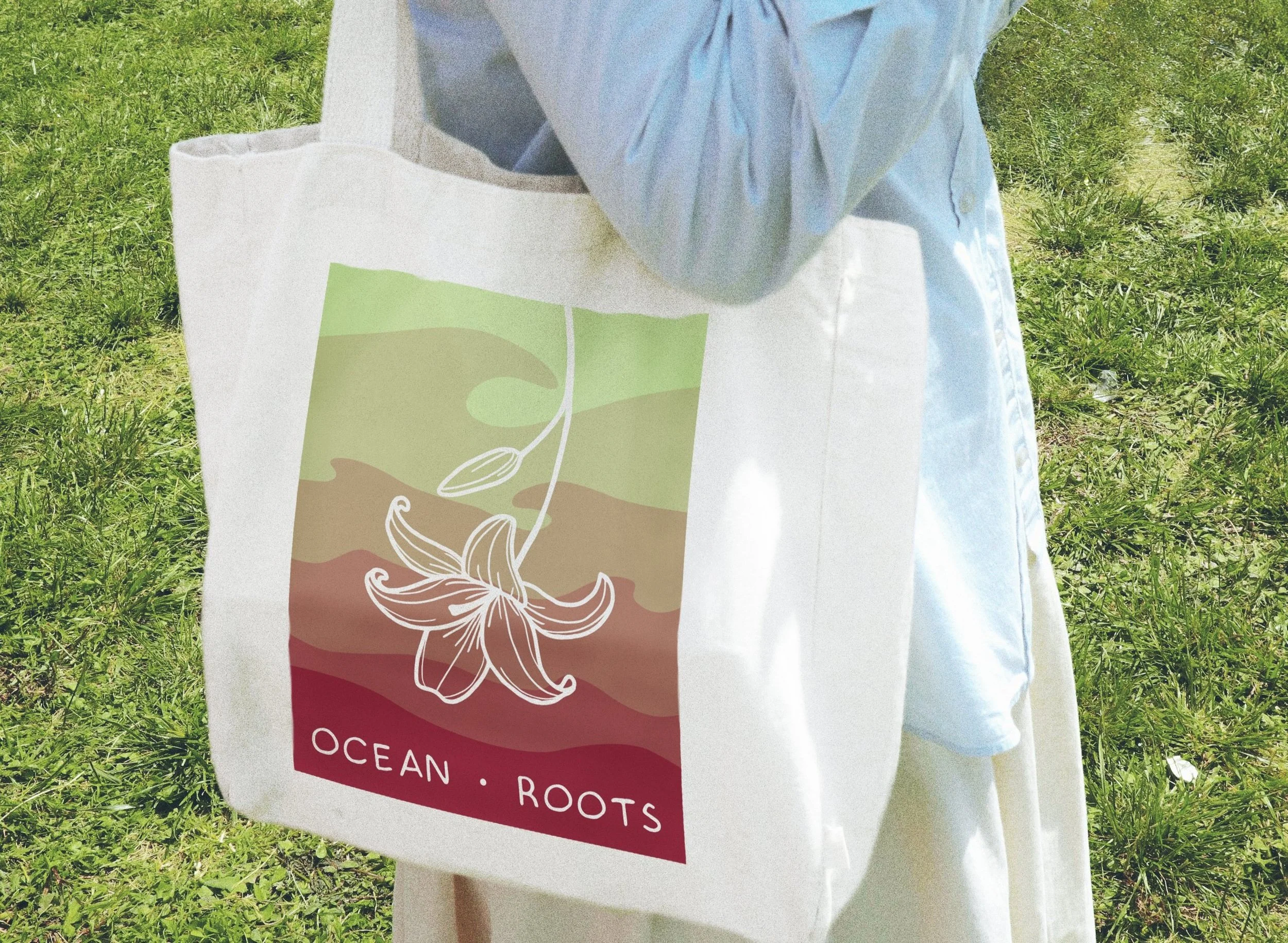
For the merchandise, I aimed to create aesthetic designs that fit in well to other beach souvenir trends. Where Ocean Roots typically utilizes simple, handwritten fonts, their sweatshirt design was meant to reflect the traditional beach style of bold type, and vibrant colors. The tote bag was similar, using subtle ocean imagery in the background, while still depicting earthy colors, as well as a subtle floral image in negative space. The lily flower used is one of several flowers native to beach landscapes.
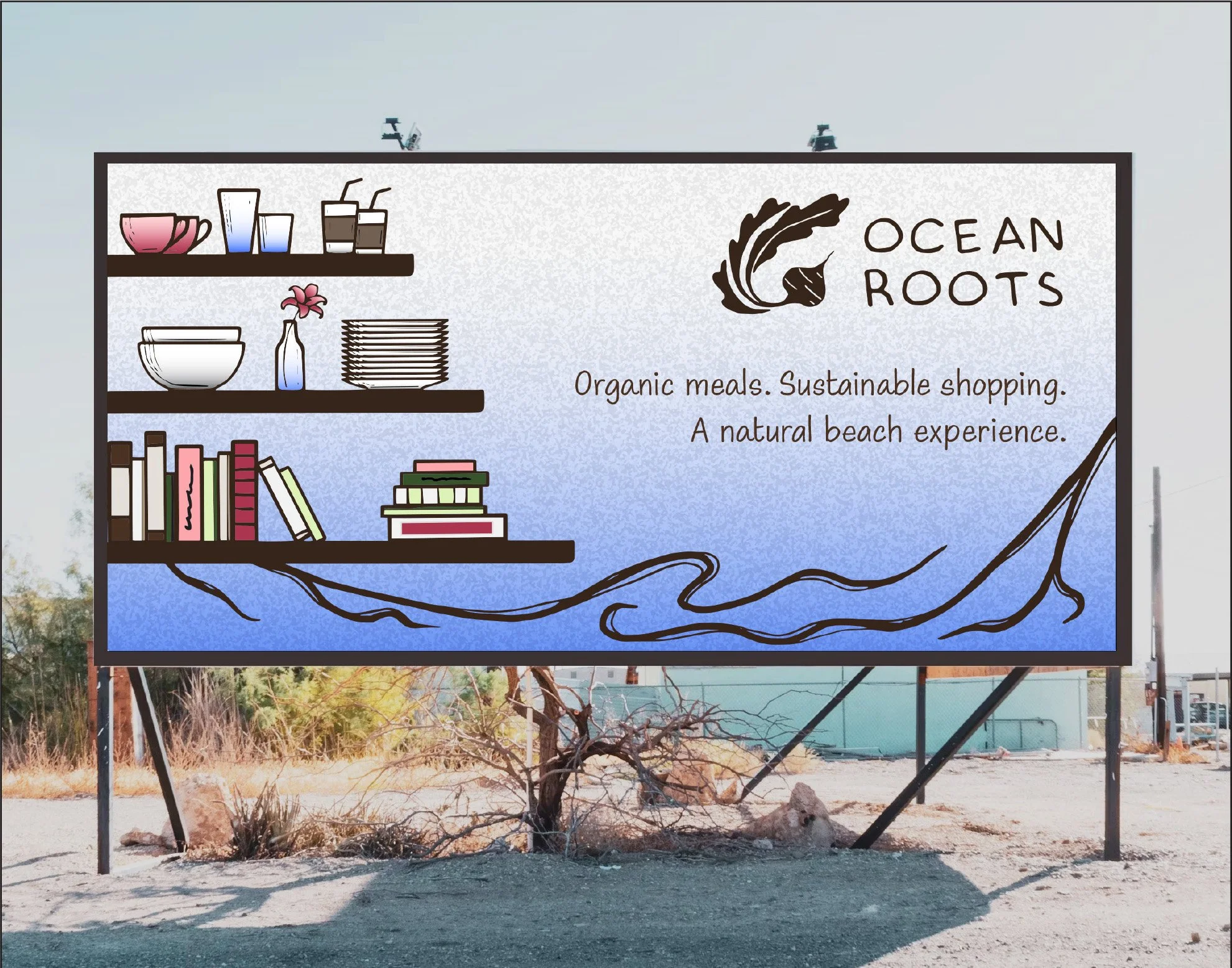
The billboard was designed to sit along one of the main roads leading into Ocean City, a road most commonly traveled by beach-goers. It is a perfect place to target Ocean Roots’ ideal customers. For that design I created a design intended to intrigue and draw people in. The illustrated feel of the design is very unique compared to the majority of other billboard on those roads, which are entirely image-based. Additionally, I designed it to promote the homey, comfortable feel that is so palpable in the shop.